

With the orgasmic activity of last week’s #MakeoverMonday, waffle charts were the dominant means of depicting the data. This time round, the “go to” chart types are either DNA chart variants, or lollipops.
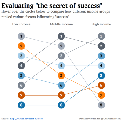
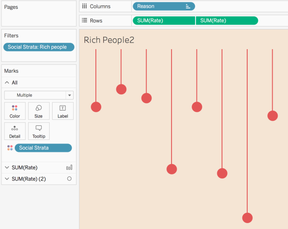
My take was a bump chart, which fell wide of the mark as it didn’t include much-needed context – I omitted to include the “Reason” on the viz itself, preferring instead to encourage users to engage interactively with the viz to uncover the main drivers in each income group:
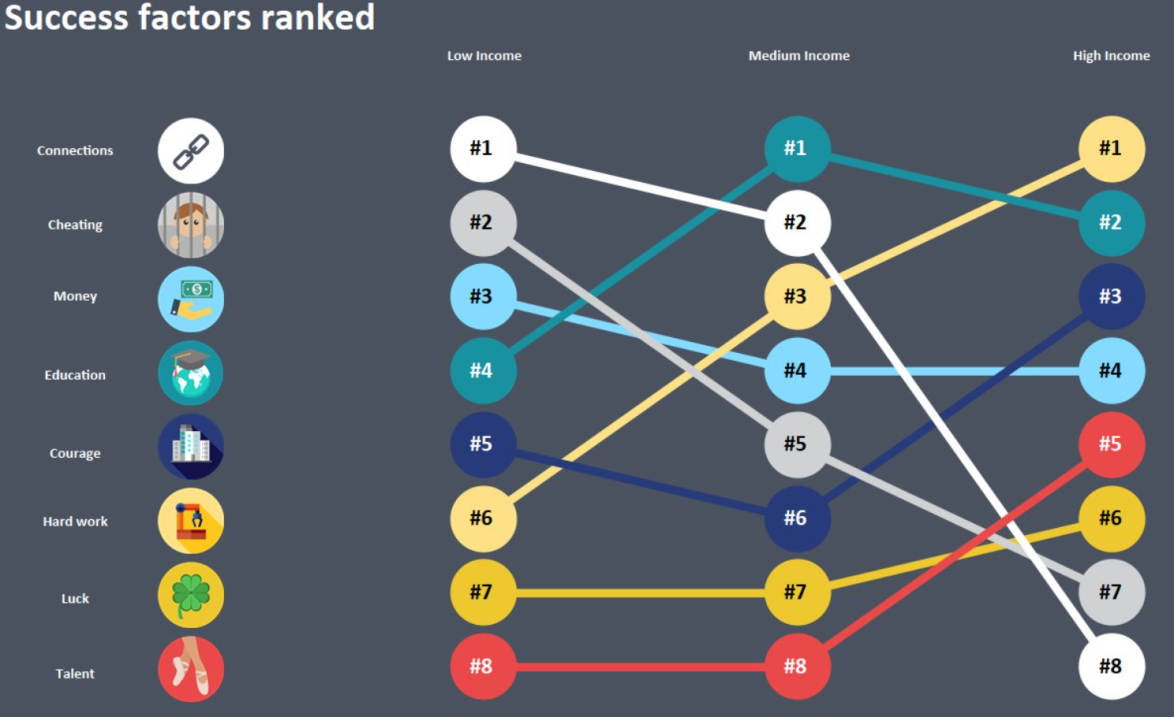
A better approach was taken by Wiktoria Gryniec, whose inclusion of the “Reason” makes for a much more accessible viz:
For this #TakeapartTuesday, I’m getting under the hood of a really nice piece of design from Filippo Mastroianni. Filippo’s flair for design caught my eye recently with this visualisation of European House Prices. If you step back and look through his whole portfolio on Tableau Public, you’ll soon see that Filippo is a consistent author with a clear trademark “style”. If he hasn’t been a featured author before, it can only be a matter of time.
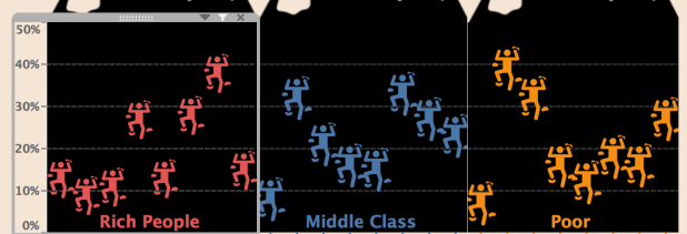
Onto the matter in hand, here’s how Filippo’s viz looked for #MakeoverMonday:
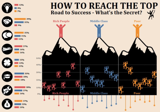
I like it for a number of reasons, but primarily the playful metaphor of “climbing to the top” and the quality of design throughout. At a technical level, I’m keen to see how Filippo combined the bars on the left, with the “upside down” lollipops and the little figures scaling the mountain.
Once again, I’ve downloaded the source workbook and will just walk through the component parts, theme by theme. First of all, how did Filippo create those climbers?
Simple and effective. It just uses a custom image of a climber in what would otherwise essentially be a bar chart! A key aspect of the overall dashboard is the use of a black background here. It certainly helps the climbers to pop out of the screen, but it serves a cunning dual purpose, which will be revealed at the end…..
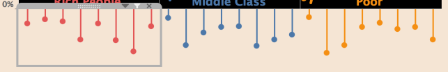
Having repeated this for the two other income groups, Filippo then reverted his attention to the “upside down” lollipops. I linked an article at the top of the post to show how lollipops are created (it’s just a dual axis line / circle), so I’ll just show one image of a worksheet to reinforce that:
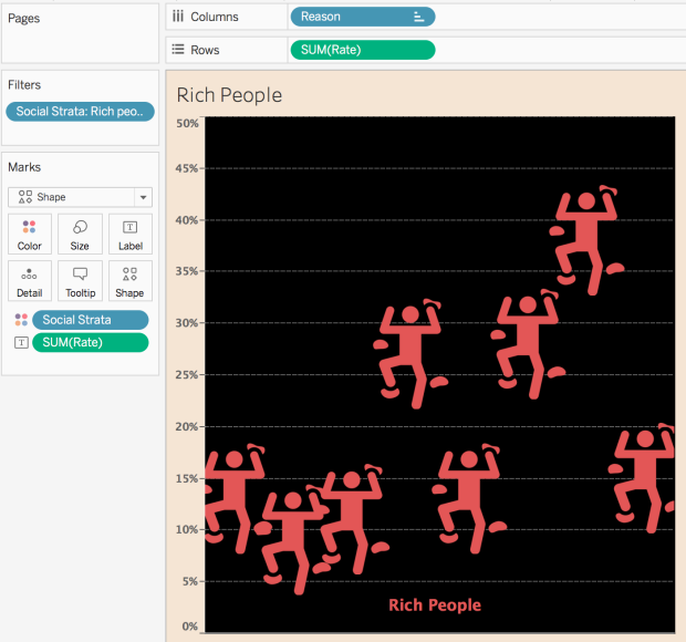
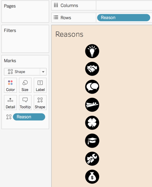
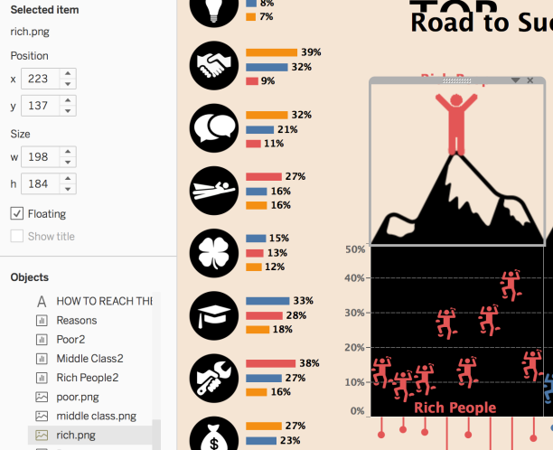
Next in the workbook, we have the column of icons, where I suspect most of the effort was expended finding / creating a uniform selection of icons. From the Tableau end, it’s a straight forward exercise:
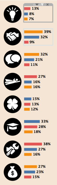
In the final dashboard, a series of bar charts are placed adjacent to those icons, to allow the viewer to get an at-a-glance indication of how significantly each income group regards each “Reason”. Those bar charts are constructed as you might expect, and sorted in descening order:
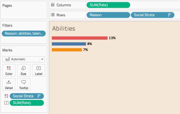
[Reason] doesn’t actually need to be on Columns and could instead just be put on Detail to drive the tooltip, but that’s the only observation of note. Hereafter, the magic is all at the stage of bringing everything together on the dashboard itself.
As is sometimes the case, Tableau Public has done something screwy and the titles look a bit wonky on the final dashboard I downloaded, but I’m focussing on chart placement and Actions, so it’s no big deal. Floating, as ever, is the method of choice for aesthetically polished visualisations like these:
Initially, the workbook was trying to convince me that everything was Tiled, but it just isn’t! So the bars are Floated next to the nice vertical icons, and then the “climbing figures” are lined up side-by-side:
With the lollipops lined up and floated underneath:
Earlier, I drew attention to the black background for the “climbing” charts. Why were they coloured that way? Well – look what sits on top of each of those charts:
They are .png files! Filippo has taken the time to create images of a mountain peak, topped with a coloured icon which ties together the colour use throughout the dashboard. The black background of the chart itself, makes it easy to blend the .png with the chart and create the illusion of single, seamless images. It’s a clever trick and I have to admit that I was fooled into searching for Floated images of entire mountains (!)
In terms of Object placement, all that’s left is to Float the titles, the various income group headings and the little climbing dude near the titles.
The final flourish on the dashboard is the Hover Actions, and they’re really easy to implement. Basically – everything highlights everything when hovered over:
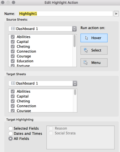
It’s another simple but nice touch, which allows interactors to connect the data together throughout the viz, via any of the four highlight sources:
- Reason icons
- Bar charts
- Lollipops
- “Climbing” chart
All in all, I think it’s such an engaging visualisation, and it felt to me like the most “complete” submission that I saw this week.
