
")
My plan for 2017 is to write a blog post taking apart a viz each week to aid my ongoing Tableau learning process. I started doing this sporadically at the tail end of 2016 and it’s an enjoyable process. To kick start 2017, I’ve decided to throw myself right in at the deep end by tackling Adam’s radial chart.

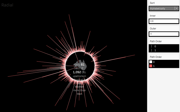
I wrote a short post outlining this chart type back in July 2016, and that included a link to the original source that Adam credited: Dave Hart – a consultant with Interworks. Originally I didn’t like the chart type as I felt it represented style over substance, but I have to concede they do look very nice. In this instance, Adam overcomes challenges interpreting the viz by including the “How to Read” section, but even without that prompt, the chart successfully draws the eye to outliers and exceptions.
Circles and curves equals trigonometric functions. My eyes glaze over when I recall wrestling with these 20+ years ago, and I’m not overly interested in the mathematics behind the calcs, as I’ll tie myself in knots. Time to get going, as there are lots of component parts to look at:
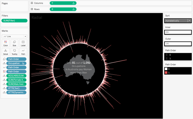
So it’s a single sheet with just a single calc on Rows and another on Columns. I’ll use those as the starting point, and work backwards as and when new calculations enter the fray.
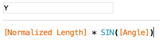
I’ll be honest – my eyes are immediately glazing over! So, we have two additional calcs within [Y], and a specific reference to a trigonometric function: SIN:
Hmm. Time for wikipedia. I still don’t get it, but that .gif in there is pretty cool. Let’s ignore that, and check out the calcs therein, starting with [Normalized Length]:
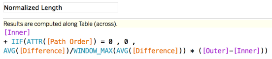
Terrific! More stuff! Now we can see the introduction of [Inner] and [Outer] parameters (identified as Parameters by their purple colouring), plus two more calcs: [Path Order] and [Difference]. Sigh. Let’s glance at the parameters first:
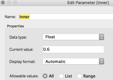
[Outer] is the same, so it just allows the user to input any value to denote the value associated with either the [Inner] or [Outer] parameters. Phew! Something understandable. We’ll see what they influence later. Onto that [Path Order] calculation now:
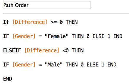
OK, there’s no escaping the need to look at the [Difference] calc, is there?
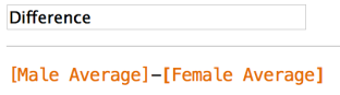
Nice and easy, but it brings two more calculations into play!
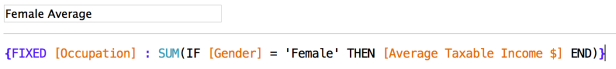
It’s a Level of Detail calculation which fixes on occupation and returns the Average Taxable Income where the Gender is Female. Easy enough to understand, and the Male iteration of the calc is exactly what you’d expect.
So now we can deduce that for [Path Order], if the Male Salary is higher than the Female Salary and the Gender is Female, a 0 is applied, else it’s a 1. The Male section of the calc states that if the Male Salary is lower than his Female counterpart, a 0 is applied, else it’s a 1. It’s basically just a means of determining whether the bar should be plotted into the circle, or outside of it.
Still not crystal clear on the whole thing, but we’re getting somewhere. Time to refer back to an earlier calc to see if we can shed some light:
Ooh. I sort of get this! Where [Path Order] is zero (i.e. Male Salary is higher and Gender is Female, or Male Salary is lower and Gender is Male) then add zero to the [Inner] parameterised value, and multiply that value by [Outer] – [Inner].
Where [Path Order] is not zero, then divide the [Difference] by the WINDOW_MAX of [Difference]. Add that to [Inner] and multiply that by [Outer] – [Inner].
What does that all mean? It’s just a means of normalising the length of the bars depicted inside and outside of the circle. The values attributed to [Inner] and [Outer] control the scale of impact of [Difference]:
Time to refer back to that [Y] calc!
So I now (vaguely) have an idea of what the [Normalized Length] bit does, and I also know that SIN() has me nodding off. What about [Angle]:
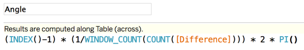
Fantastic, another easy one to pick apart (!)
I’m likely mistaken, but I believe it’s just determining the angle to allocate to each segment of the circle (i.e. each occupation). There’s a lot of supposition here, so I decided to find out some actual numbers to try and validate this guesswork. I just dragged a bunch of Measures onto Tooltips, deleted some of the existing Tooltip content and zoomed right in:
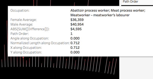
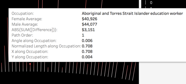
OK, this is helping, as I can start to see how [Angle] is calculating (these are, alphabetically, the first two occupations), but there is an easier way. Let’s look at a table to take in more data and calcs at once:
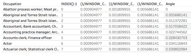
I’ve just broken down the [Angle] calc to validate my assumption that it’s just evenly segmenting the circle based on the occupation row – it is. The INDEX()-1 is the row position, minus one. The next calc just represents (1/1105), with 1,105 being the number of occupations in the dataset. The next calc doubles that value, and the next multiplies that by Pi. The final stage of [Angle] multiplies that final value by the indexed row identifier.
So it’s by no means conclusive, but there is a semblance of an understanding of some elements of [Y]. Fortunately [X] just retreads a lot of that ground and just bungs another trigonometry foe from the past into the mix:
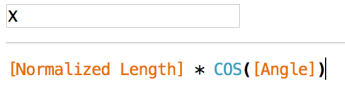 I’m not dwelling on COS() much:
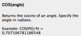
That’s what the Tableau calc help implies, and the earlier wikipedia link above elaborates more. Again, it’s too much for my ageing head to absorb at this stage, so just plagiarise the calcs and keep your fingers crossed!
I’ve covered (sort of!) the main aspects of the viz. It’s fiddly, it looks cool, and reassuringly, people appear to tend to just nick ideas from a viz from days gone by, and apply it to a current data source.
Did I learn stuff? Yes. Will I be able to use it in future? I’m not sure. I need to understand how and why things work, and whilst I picked up some ideas in this process, I definitely don’t fully “get” radial charts, so my annoying way of working probably won’t allow me to make use of this chart type.

Another great post Charlie!
To me, the Tableau community is fantastic for things like this – deconstructing vizzes or documenting in detail how to create them. You can then understand them on two levels:
1) Enough to see what each bit does, even if you don’f fully understand it
2) Enough to fully understand every constituent part.
Looks like you’re at (1) – I know I don’t get past (1) on most similar documentations. But the great thing is that (1) is usually enough to understand, adapt and recreate with your own data, as there is always support around. usually from the originators and experts behind the original visualisation.
I’m definitely at (1) looking at some other curved vizzes using Bezier curves and the like. In my case, as an ageing ex-mathematician, I actually *get* the trigonometry and algebra functions, whereas it’s some (most) of the Tableau functions and wizardry that leave me more baffled. Maybe if we collaborated we’d make a genius pair, so long as we don’t both glaze over in bafflement at the same bits!
cheers
Neil
LikeLiked by 1 person
Thanks Neil!
Whilst I work in a numeric field, it focuses more on out-and-out arithmetic, rather than all the complicated aspects!
One thing I did like when we tested out Power BI at work was the fact that user created visualisations like Sankey’s, Radial Charts, Curvy Stuff could be imported as an artefacts into the tool and populated with “your own” data. In some cases that would be a nice easy solution, but I guess I’d miss out on learning opportunities like this.
LikeLike
Great post! In the data there is the “Sort” measure used to sort the data Alphabetically or by Salary Difference. Not sure where this measure was included to actually sort the data. Did you understood that part? Thanks for your help!
LikeLike