

For #MakeoverMonday this week, I created a very straightforward visualisation. The data broke down Sydney ferry trips by month, route and commuter type. I chose to ignore the latter Dimension and to draw attention to the most popular route, and explore any seasonality trends for each of the routes.
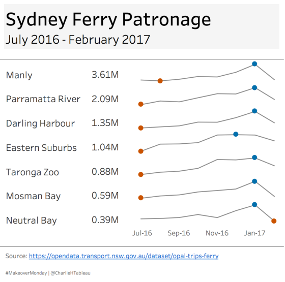
First of all, I created a really simple text table to show the total number of trips on each route. I love “big ass numbers” and incorporate them regularly at work. It’s a simple and effective technique:
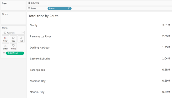
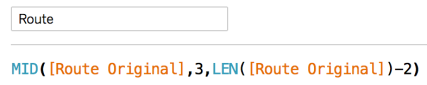
If there is anything to note, it’s just that I cleaned up the original route Dimension to exclude the “FX” prefix:
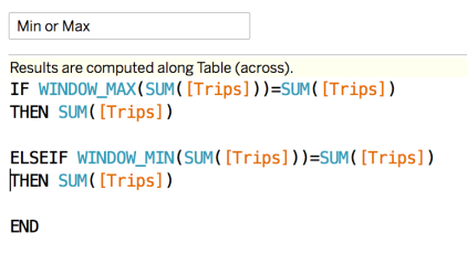
The second sheet was the fiddlier one. I knew that I wanted to create a sparkline with the MIN and MAX trips month highlighted for each route. I felt that I could refer to one of Andy Kriebel‘s recent video guides to do this:
But it just didn’t work. Not sure what the problem was, but I just couldn’t get the axes to synchronise correctly. I referred to this quick tip from Lorna Eden, but the data type wasn’t the issue:
So, what did I do? If you can’t get a Level of Detail calculation to work as you want, you can always resort to a Table Calculation:
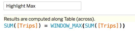
A problem with this is that if I tried to use it on the Colour Shelf, I’d get a continuous range of values, rather than a discrete, binary sort of colour option. That’s easily resolved with the addition of a basic boolean calc:
So the final worksheet looked like this:
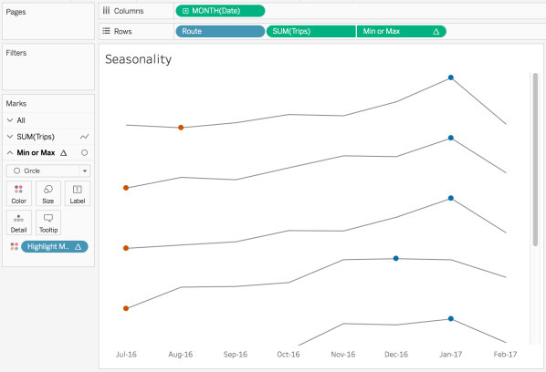
All very simple. I used the Colour Blind palette to colour the circles, and that’s pretty much the only point of note. The final visualisation is shown below, and can be downloaded here. It’s essentially a tiled dashboard, with a couple of Floated, shaded text boxes to create the horizontal line breaks.
UPDATE!
Andy Kriebel detailed how to overcome the issues I faced with Level of Detail calculations on his #TableauTipTuesday the very next day. It also highlighted a mistake I made on my original submission, as I’d used two separate sheets and hadn’t sorted them both in the same way, so the Big Ass Numbers and sparklines were out of sync:

You’re gonna kick yourself when you see the LOD solution. Though it’s not all that straightforward.
LikeLike
Scott joined Web Archive in September of 2015. http://staryfolwark.nazwa.pl/component/easybookreloaded/
LikeLike
Good article. I absolutely love this website. Continue the good work!
LikeLike