
Viz5 partnered with Hope for Girls & Women, Crowd2Map, and the Tanzania Development Trust (TDT) to highlight their critically important work in the fight against FGM. Eva’s decision to use the #MakeoverMonday platform to highlight causes like these was absolutely fantastic, and it has been brilliant to see so many good vizzes this week.
Here’s the original visualisation:

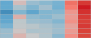
What works well:
- The dashboard covers a range of different metrics
- The pie chart works OK – not too many segments to make it an overwhelming wall of colour
- Everything is fairly minimalistic. There’s no clutter.
What could be improved:
- It’s very “default”. Little details like having ‘Month of Date of arrival…” on an axis are easily tidied up and would add more polish to the viz
- It isn’t made clear what the safe houses are actually offering shelter from
- The plight of women and girls in Tanzania who are at risk of these awful practices isn’t really a focal point of the overall dashboard. How can it be made more powerful?
What I did
- It’s another cop-out week for me because work and time in general were against me as has been the case quite a bit recently
- I found this topic quite an eye-opening and upsetting one. That’s the power of data. We live in our little bubbles and it’s the sharing of information like this which makes you realise just what else is going on in the World and the sort of situations that others have to endure. My daughters are 7 and 10 and the fact that girls of their age are still subjected to FGM in 2020 shocks and upsets me
- That focus on age is the core of my viz. Basic charts and basic annotations draw attention to key points, but the data alone is extraordinarily powerful. There’s a three year-old in the data. It’s terrifying to even think about
Here’s a link to my final viz.

