Maybe there’s a deep-seated Freudian meaning behind it all. I just like balls on lines, what can I say?
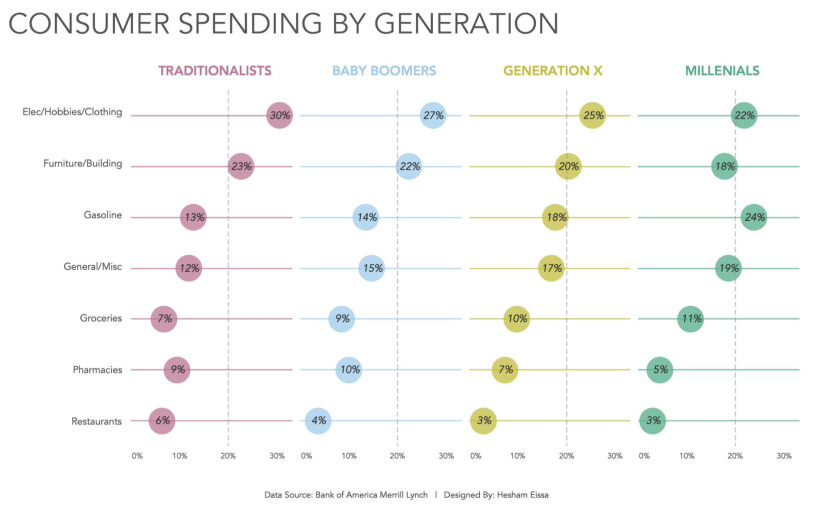
Last week I wrote about a technique that I picked up from Johanie Fournier, and this week I’m detailing a variation on the same theme that I saw in a visualisation submitted by Hesham Eissa.
Here is an image of Hesham’s work, and a link to it on Tableau Public.
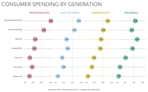
For me, it’s a real boat floater. I love the simplicity of it and the consistency of colour that I harped on about in my blog post last week. It has similarities to Johanie’s work, but there are some subtle variations which mean that the build is actually quite different. Time to get down to it!
Experience tells me a couple of things straight off the bat. First, the coloured generation headings aren’t part of the main sheet because we can’t apply dimension member specific colour to headers – it has to be to a Mark. Nope, that’s a separate sheet formatted as shown here:
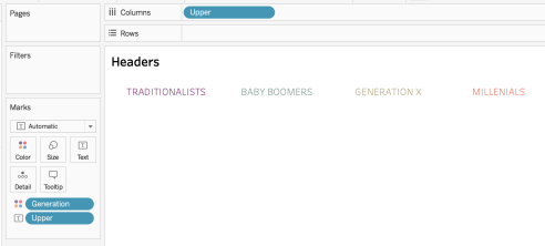
So I’ve put [Upper] on Columns AND Text, and have then hidden the header and put Generation on Colour. [Upper] is just a calc to force the Generation field into uppercase:
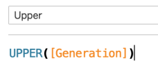
There’s something about uppercase which sometimes resonates more for me than normal or lowercase, and I am more than happy to follow Hesham’s lead with this design decision.
The fiddlier bit of this viz was always going to be the main sheet, but it’s not *that* complicated. From looking at it, we know that Category is on Rows and Generation (or [Upper]) is on Columns. We also know that the [% of Spending] Measure is on Columns. Our only real consideration is how to create that coloured horizontal line. Of course, Hesham could have created four separate sheets and manually colour coded the zero lines, but that would be onerous. There’s a better solution – Gantt bars.
Before cracking on with that, let’s just plot the initial circles:
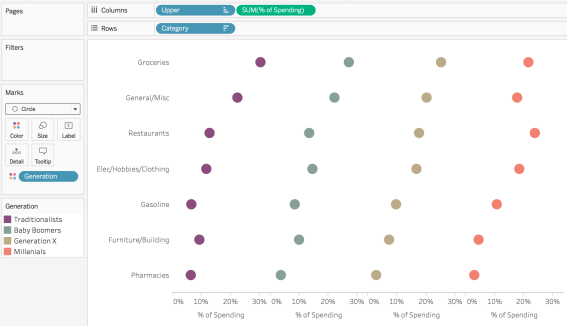
Nice. Now we just need a bunch of lines. To plot the horizontal line, we know that all these Measures must start at zero, so that’s our first building block:
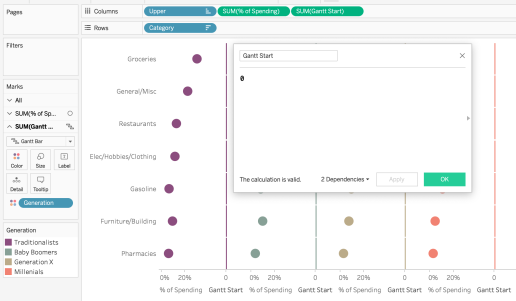
If there’s an easier “calculation” than that, I want to see it!
Next up, we know we need to plot something to denote the end point of the horizontal line as we know we can put that value on Size with a Gantt chart and the rest is done for us. It’s really important when you’re creating a chart like this that you are comparing all Dimension members against a common scale or the analysis can be misleading. My approach was to use this calculation:
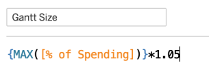
I’m taking the largest [% of Spending] value in the dataset and then sticking on an additional 5% to let things breathe a little (more about that later). It we pop that onto Size and then drop Generation onto Colour, things are looking up:
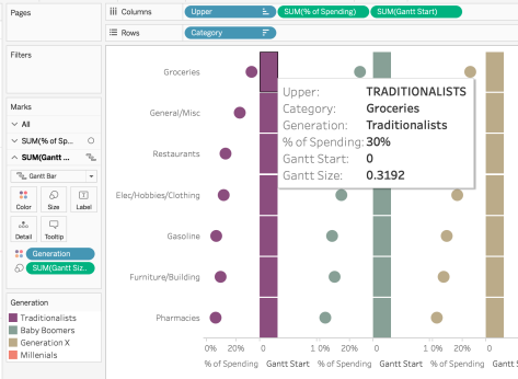
You can see that the horizontal plane across each cell is equal. The 0.3192 value for [Gantt Size] is the equivalent of 30.4%*105%, with 30.4% being the top [% of Spending] value in the data set. Marvellous.
Now it’s just tidy up time. Make these dual-axes, remove Measure Names from Colour and reduce Size on the Gantt axis:
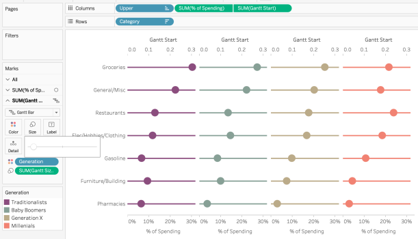
Add the relevant labels, hide a superfluous axis and bring everything together to get something like this:
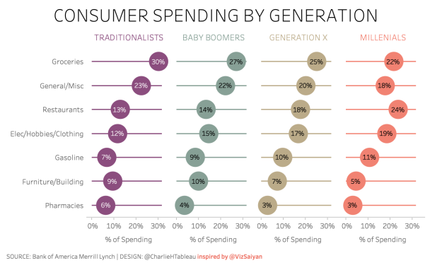
For the eagle-eyed – let’s see how it looks if I don’t have that *1.05 element in my [Gantt size] calculation. Compare the image below to the one above:
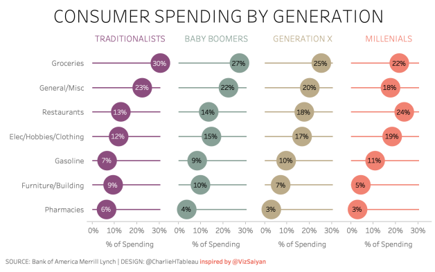
It’s barely perceptible, but this stuff matters to me!
See how the Groceries Category for Baby Boomers appears to be at the end of the line, the same as for Traditionalists? In the version with the padding, you can *just* see the horizontal line extend beyond the circle. This is the choice you make when plotting a big circle on an axis where the diameter of that circle equates to about 8%.
Whilst the circle is directly labeled to clarify its value, I prefer to also allow the horizontal line to peek out and say hello, to further reinforce the fact that the Traditionalists value for Groceries is higher. That is how OCD I am.
My recreation of Hesham’s viz can be found online here. I absolutely love the simplicity of the design and this approach probably betters the third viz I created last week. Hope you learned something if you’ve made it this far, thanks to Hesham for teaching me something new, and I looking forward to seeing what I learn next week.
As a point of deliberation about this form of presenting data, consider this blog post from Chris Love. Is it OK to cap the horizontal limit in the way that Hesham did? Personally, I’m cool with it, but there is always value in standing back and considering the points Chris makes in that post.

