
On the way home from work today, I was re-reading the excellent ‘Storytelling with Data‘ by Cole Nussbaumer Knaflic, and a really basic chart caught my eye. All it essentially did was show a scatterplot where marks above an average were coloured differently to those that were below the average.
The point is that adding that additional level of encoding makes these data points stand out. It’s simple and effective visual cue, and I realised that I didn’t actually know how to do it in Tableau. So I figured it out.
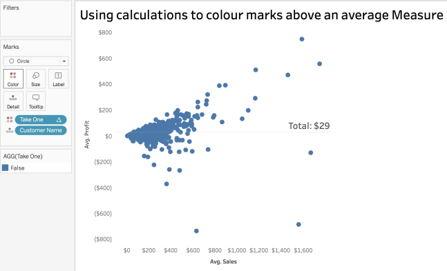
Using Sample – Superstore in the 10.2 Beta, I constructed this basic chart:
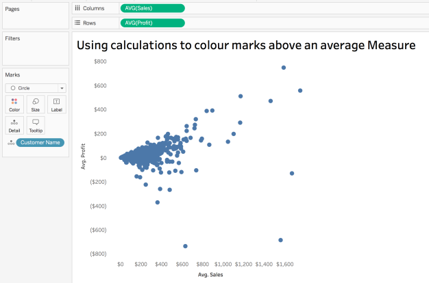
Basic stuff, with some tidying up done to remove extraneous crap like gridlines, zero lines, borderlines etc. Tableau really should default to clearing all of that stuff out of the default settings. The example I want to recreate showed all marks above the overall average given a uniform colour, and all others given another colour. OK, sounds easy. As I see it, there are a couple of steps:
- Add and validate an Average Line from the Analytics pane to one of my Measures – I’ll do Avg. Profit
- Create a boolean calculation to identify those marks where the Customer AVG(Profit) exceeds the overall AVG(Profit)
The first part is easy, but you do need to pay attention. Looks what happens if I just shove AVG(Profit) at the level Entire Table onto the view:
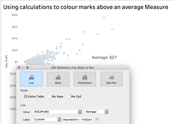
The average of AVG(PROFIT) shows as $27. Is that right?
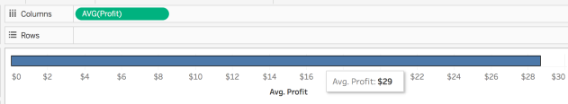
No. The AVG(Profit) is actually $29. So what went wrong? The aggregation of the AVG(Profit) needs to be TOTAL rather than AVERAGE:

This is an error that I’ve seen people make a few times at work. The danger of a tool like Tableau in the wrong hands is that it can increase the likelihood of innocent mistakes like these being made. There’s a temptation to assume that the default settings always return the correct result. Always validate your calculations!
Part one ticked off easily enough. Onto the calculation now – all we want to do is write something that says:
“Is the AVG(Profit) for the Customer Name greater than the TOTAL AVG(Profit)?”
Miraculously, I got this to work on my first attempt, and even more miraculously, I then rewrote it another way using a Level of Detail calc which yielded the same result! There is almost always more than one way to skin a Tableau cat, and when it comes to calculations there are LOADS of ways. And lots of cats.
Take One:
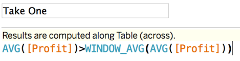
WINDOW_AVG is a table calculation which returns the average of the expression within the window. So by comparing the AVG(Profit) at a Customer Name level (as that’s the level of detail in the view), we should get a result. What happens when we put Take One on Colour?
Diddy squat, because we haven’t told the table calc how to Compute. With the default Table Across Compute Using, Tableau isn’t being told at what level to evaluate the statement. That’s easy enough to fix:
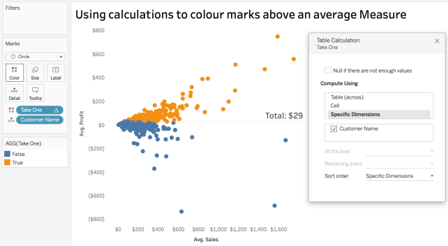
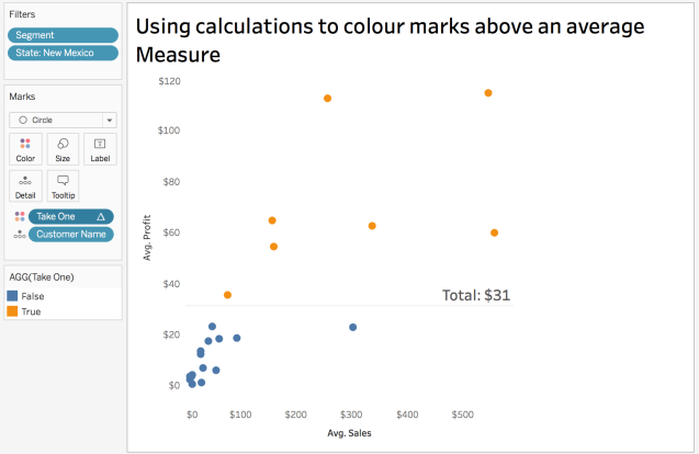
Excellent. This is the desired result, and a level of smugness is achieved as I haven’t used a WINDOW_AVG before. Cole’s data only had maybe 15-20 marks, so is a lot less hectic than the 793 marks on display here, so I added some filters to make things a little more comparable:
There’s more! I started to think about other ways of achieving the same effect, and Level of Detail calcs popped into my head. My approach here was to use EXCLUDE.
EXCLUDE level of detail expressions declare dimensions to omit from the view level of detail.
I know that Customer Name currently breaks up the view, so what I need to find is an equivalent result to WINDOW_AVG, which can compare the Customer Name level AVG(Profit) to the TOTAL AVG(Profit). Here’s how I did it:
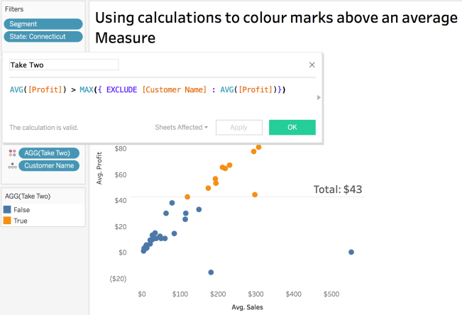
So I take the Customer Name level average, and then check to see if it is greater than the AVG(Profit) at the overall level by EXCLUDING the Customer Name from that part of the calculation.
Note that the LoD element is wrapped in a MAX() function. That is necessary to avoid mixing aggregated and non-aggregated values. Using MAX() or MIN() is fine in these cases, as we’re effectively looking at the overall average, so it by definition can be regarded as the MIN() or MAX(), as it is the same value.
A bonus of LoDs is that unlike table calcs, I don’t need to trouble myself with Compute Using, so it is just placed on Colour and that’s the end of it.
So two (of many) solutions to the same basic challenge.
